View Metadata Map
Usage Notes
It is unlikely that the font registered will accurately reflect the specific typeface used, though the weight, style and size may be more accurate. Font styles and sizes in the nineteenth century often reflected something about the genre of the newspaper. Most newspapers would use different typefaces for the masthead, adverts and editorials, and some might choose to use a nondescript font for ease. As technology made it easier to standardise, these decisions became formalised. OCR software has difficulty with older font styles and will not always recognise them correctly.
Examples:
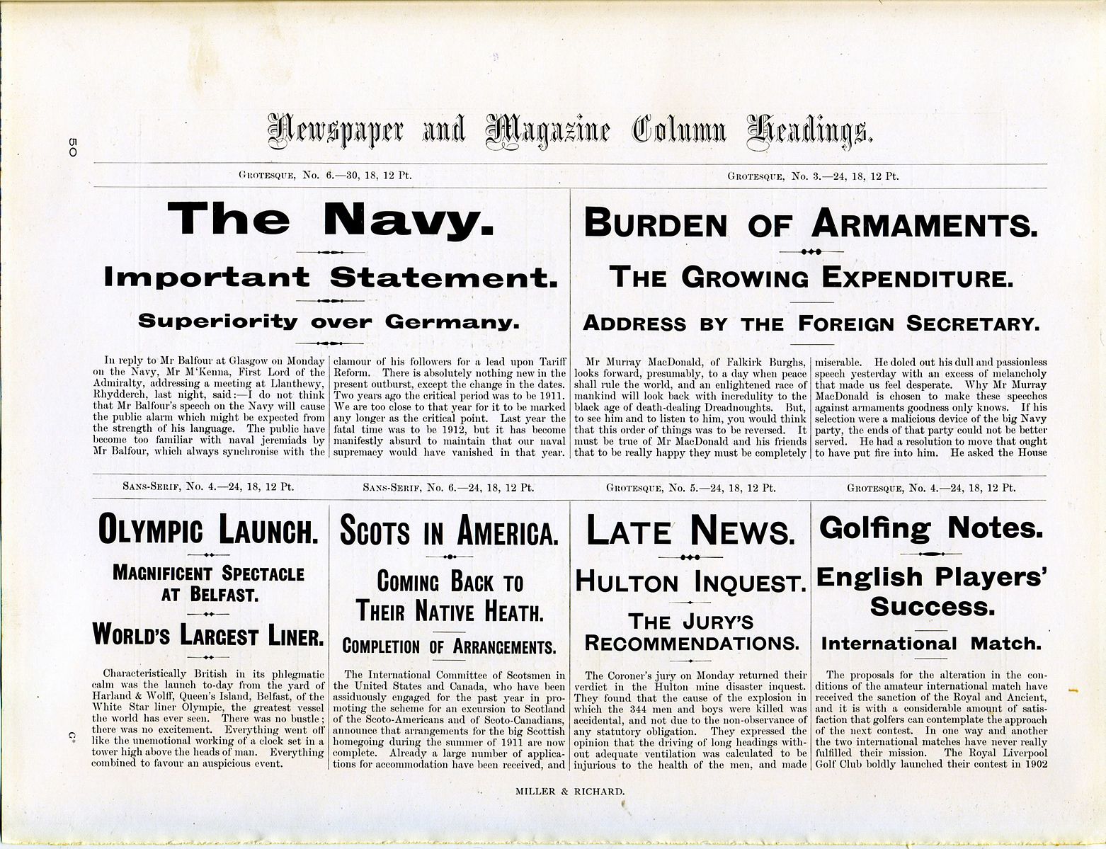
Miller & Richard newspaper type specimen. Wikimedia Commons.
.jpg)
“The increased use of machine typesetting, improvements in inking and newsprint production technologies and changing fashions in layout increasingly affected font choice, though not always offering greater freedom: the new technologies of monotype and linotype along with a zeal for economically efficient standardization of line size and ease of justification for unmarked text restricted the possibilities of type design.” [DCNJ AGJ/AK, 643-44]
“Columns are basic units of design in newspapers and periodicals that distinguish serials from most printed books and predate later additions of page design such as tiered headlines, subheads, font variation and imaginative layout.” [DCNJ LRB/AK, 134]
“A rough estimation shows that the number of distinguishable content pieces within one newspaper issue increases dramatically over the years. In a newspaper of the 18th century some dozens of articles and advertisements can be found, already in the 19th century hundreds of single news can be found and at the heyday of newspapers in the 20th century even some thousand news are included in one issue. This development goes along with an enlargement of the paper size and a reduction of the font size so that more and more text can be delivered to the reader.” [Europeana Newspapers 2015, 19]